Entry 41 or selecting and controlling
Apr 21, 2011
My progress has been a bit broken into pieces, as I do a little from everything, resulting in no posts since I cannot get coherent output.
Selecty
Let’s improve the “command buttons”, i.e. the UI buttons player uses to issue commands. These typically have either right-click (+ SHIFT/CTRL key modifier) defaults or a keyboard shortcut. But, nevertheless, necessary for first use or to see what the actual shortcuts are. Here is a drone selected:

Of course, every unit in a group must be able to perform an action (disregarding unit type cycling, like Starcraft or Warcraft tabbing):

Here’s a UI panel for background:

This also brings me to an interesting point. Do I even want such “buttoned” UI? Is there anything not achievable with on-map keypresses? And how would Xbox controller work?
 or something..
Clicky
Currently objects under the cursor got semi-transparented so I can see which I am selecting. Unfortunately, XNA can only color-tint individual sprites, and I need a new spriteset to do stuff like glowing border or outline. I also cannot do this with shaders, because the sprites need to be drawn in a specific order (depth) and XNA doesn’t draw them up until I have specified all the sprites to be drawn at what depth. I really don’t want duplicate sprites for glow effects and such, because units alone take up 32×5 sprites just for walking. So, anyway, here’s unit selection by a little highlight underneath:

Also, you know what, let’s get rid of health blocks and do it Starcraft/Warcraft style. Only show health bar for the mouse-over unit/building or for all when holding Alt key. Sure, I feel kind of bad that I don’t come up with this myself; but — hey — I also cannot think of better way. I don’t want health bars constantly there, for that will break the little immersion I have. So here’s regular mouseover:

Here’s holding Alt:

The highlight ring is a bit silly, but I’ll fix it.
Now, we need to scale the selector rings:

… but they look real crappy this way. Suuure, I could do these circles with shaders and then make pretty effects; but screw it — here’s just several different-sized sprites:
![]()
Each unit/building type will just store a little flag of which selector size it uses, then draw that one. So anyway, selection works fine now:
 and
and 
Well this has been one of the messier posts. But I am working on one of the messier and tedious parts.
Entry 42 or rain
Apr 25, 2011
Rain. No, not in real life. Screw real life, it’s sun and sun and sun all day, reflecting of any bright surfaces making it impossible to sleep or work. The worst (discounting morning wake-up sun) is between 3 and 6 pm, where there is basically a limbo between “not that bright for leaving” but “too bright for working” zone.
Rain drops
So yeah. I guess that’s when my subconsciousness decided to make rain in-game:

Ahh, nice and cool. There is just one sprite for rain:
![]()
It’s some Gaussian noise, motion blurred, and level-adjusted to leave behind several rain “drops”. I have to draw lines because the eye will see round drops and that doesn’t look any good. Lines make it seem “faster” rain.
Anyway, I put about 400 (at 1650×1080) semi-transparent sprites on screen, each is moving downwards, then wrapping around to the top again. Some are falling faster, some slower. By doing that, it is not so obvious that it is the same sprite, as they significantly overlap.
I’m still on 60 fps. Runs at 140-150 fps without fixed time step cap. And 150-160 fps without rain, so 10fps difference? A* and depth-sorted objects are bound to eat much more. Also, drawing 400 times 300×300 30-drop sprites is much faster than 12000 times 5×20 sprites, even though the necessary cumulative “target area” is ?1000 times less.
Also, as the player pans the camera, the rain is “moved”, but only to the sides. This creates the impression that the rain is actually falling towards the ground, not just an overlay in front of the screen. (Of course, I’m miles away from making a realistic 3D looking rain like in StarCraft 2, where you can see it falling towards the ground. Anyway, let’s not dwell on that) The problem is that it’s falling roughly the same speed the camera is. So if the player pans the camera down, half the drop “hang in the air” because the sprite “falls” down the same distance as the camera does. This makes the player see the actual rain lines, which is not what I want. But, through some experimentation, adjusting the rain speed by 50% makes it look best.
Drop splashes
Anyway, when rain “hits” the ground, splashes appear.

Obviously it’s all fake. Rain drop lines don’t match up with splash locations. But it is also only noticeable when you pay a great deal of attention to it. After all, it’s all random.
Finally, splashes should only appear on visible tiles (not unexplored/fog-of-war/out-of-bounds):
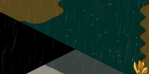
So, yeah, I have rain now. It gives a nice “dynamic texturing” to the game. By dynamic I mean the world is “live”, as rain constantly provides a pattern of drops to keep the eyes busy; but at the same time is random enough to be discarded by brain when focusing on other things. And by texturing I mean it is best seen on grass/dirt, any solid sprite, that would otherwise be boring.
Entry 43 or user inteface components
Sep 2, 2011
Last two days I spent making components for a window-based user interface. This means fully customizable windows, buttons, checkboxes, etc. This makes creating new windows and assigning various controls very easy. In addition, I spent some quality time in Photoshop and I think these came out nicely:

These controls are customizable by their most important values. All captions can be changed. Windows can be set to any size, button can be stretched, etc. In addition, controls can be enabled/disabled. This can be done are run-time as well.
Since UI is not running on a separate thread (and there is no need for that), then the UI component values can be used/translated directly into some in-game options. For example, a checkbox “checked” value can directly translate to whether it rains or not without any intermediate variables.
I quite like the spacey look of these. I’m not very good at drawing medieval RPG interface, but I think I can do decently with a more sci-fi oriented themes.
These will be used for every in-game dialog that requires some user interaction. The windows can properly detect user input (mouse, currently) and which components are being interacted with. Also, since this is built on classes, then I have freedom in adjusting/adopting the design to any kind of floaty/showy/clicky style and purpose I want.
Entry 44 or building placements
Sep 30, 2011
Time for a post! I’ve been a little busy with the game and taking it into a more down-to-earth implementable direction (I’ve said this before, haven’t I?). I’ll try to document the features accordingly, then let them unveil themselves into what I’m making. (Towers, mobs, paths — I know right, it’s impossible to figure it out! :) )
Most stuff is based on existing code modified and sub-polished to pre-art asset prototypes. Today’s topic — building UI.
Building placement
Long story short — I made buildings in the game and let the player place them wherever they want on the map. First the player would select what to build (i.e. your usual RTS style building menu):

Then they would choose where to build this, with the region highlighted as to where they can or cannot build there:

A simple thing but quite some logic behind it. Buildings can be in different sizes, so the region has to be sized accordingly, and each building type stores its size information. Secondly, the renderer needs to know how to optimally draw the semi-transparent preview and all the indicator tiles under it. And of course, lots of faffing about with the interface and mouse to coordinates, coordinates to world validations, world checks to renderer distances/tiles conversions. Plus I need to store if the player is building or not at the moment and make sure other actions (menu, escape, clicks, scrolling, game events) are correctly handled.
Better building placement
Now here’s an alternative to the RTS formula, that let’s the player make decisions a little more intuitively. First thing is terrain selection, which happens by default as the player moves the mouse:

This serves the purpose of informing the player, where they can build their building. It should be quickly intuitive after moving the mouse around a bit that white is OK and red is not OK. Next, clicking the spot reveals a radial menu at the cursor location prompting which building to build (or just generally an action for future radial menu pruposes):

The selected building is then built there. Easy as pie. If the player moves the mouse too far away or does any other action (escape, menu, click, select something, etc.), the menu is hidden.
There is another consideration though — existing buildings. The selection rectangle must not only respond correctly to building-occupied squares, but also hide itself and instead highlight the intuitively mouse-overed building. I did the code for this some time ago and now it’s finally tying nicely with user visual feedback:
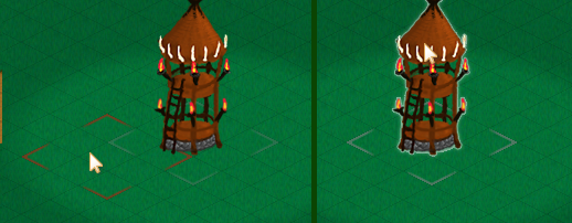
Note also the barely visible existing building location indicators that are obvious when you know to look for them, but don’t distract from gameplay (too much).
But at the same time, the player may want to build behind, so holding Shift solves that:

There is a downside to this building method though: the selector region is 3×3, but buildings can be any size. Bah — worry about it later :) The upside is that this is perfect for XBox controller that needs as little thumbstick thumbing as possible.
Entry 45 with improved UI for building manipulation
Oct 3, 2011
Build radial menu
So the building build menu consists of:
* Highlight of the selected region where the building would be placed
* A simple ring to stress the radial nature of this pop-up menu
* Buttons (color-tinted background and element icon) that scale as the player mouse-overs
* A tooltip window with relevant info as the player mouse-overs
* A translucent building preview of the respective building as the player mouse-overs:

Upgrade radial menu
Clicking a tower brings up a similar menu. In addition to above features:
* The button graphics represent their action — upgrade or destroy (lacking icon though:))

This still needs build/upgrade progress bar when applicable. And potentially more options, such as, target priority or option to disable.
Don’t you mouseover there
There’s quite a few tiny details that have to be taken into account. For example, when there is an open radial menu, the mouse shouldn’t select or make any terrain preview rectangles while it is inside the region of the menu. So here the mouse doesn’t register building underneath:

While a rather obvious thing, it starts to get messy quick in code when there is a hundred and one that the player could suddenly decide to do.
Improved behind-the-buildings placement
I even further improved how holding shift key behaves when hovering over building and attempting to build behind:

Now it also shows a little color helper. Since towers can stand very tall, this should be a useful tool (mental note: properly introduced in the tutorial).
Pressing shift at any time cancels current upgrade/build menu and/or selected thing and goes into building preview mode. So this serves as instant “screw this window, I want to build more” mode.
Placeholders 2.0
All about upgrades this time. The levels of awesomeness of this project have exceeded the epic levels by so much that even the placeholders got an upgrade. :) Here’s the four tower concept sketches (not done by me, in case that’s not obvious):

These and element icons were done Philip Barker (http://philipbarkerbyu.blogspot.com/).
Entry 46 that may explain the game a little better
Oct 5, 2011
So I’ve been putting off explaining the game proper, because I did not have enough details and did not want to do guesswork (read: I’m lazy). So long story short, I’m collaborating with Philip Barker (blog, devdiary), an artist, for a Tower Defense game featuring elemental towers.
TD
There are four types of tower elements — earth, fire, air, water. Most of these can be combined into unique combination:

We decided to have each of these towers be unique and different from others. I guess you cannot really invent that many new things beyond the basic “flail projectile” at the mobs. So we’re trying our best to have variety in towers, projectiles, debuffs, resulting effects, and mob effects.
Here’s a base of the fire tower Philip drew:

Epiiic.
Projectiles
Here’s a quick concept preview of the projectiles:

You can see the 4 element projectiles. This, of course, need variety and uniqueness. For examples, I attempted an “air slash” from fighting games type of air projectile.
There is also a little smoke animation. This is used for fire projectiles as they fly about and occasionally emit a smoke cloud. This gives some life to the scene and stresses out the “burning” part of the projectile:
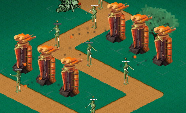
One thing I’ve noticed is that I’m trying to make everything so frikin’ small. Possibly because I am trying to hide my inability to draw ;) There’s really no point in doing everything so minuscule you need a screen magnifier to play the game. So there’s one thing I should keep in mind.
Day/night
Here’s a little preview of day/night lighting:

Just one more thing in addition to whether that can really set the mood and bring variety into play (so to speak).
Not another radial menu
Finally, I’ll leave you with a new radial menu design:

Yay!
Entry 47 concerning never-done construction UI
Oct 7, 2011
This is like one of those city legends — the day you finish building the city, it will sink to ground. So, here we go: hopefully last large iteration/prototype for building placement.
Radialus Menuius
So here’s another radial menu iteration:
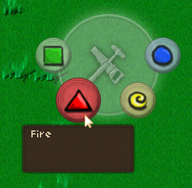
This time there is no direct preview, because the player will not click directly at the site the building will be constructed. Instead, they get a typical RTS style placement option:

(The range indicator ring was done with shaders. So very extra complex that needed, but allows for nice customization.)
Arbitrary placement
This change was done primarily because we decided to remove the isometric grid from the game, so that the tower can be placed anywhere. After all, with this game engine, it’s not required to have anything bound to specific tiles. (Not that this doesn’t now make the code into spaghetti from hell…)
Secondly, it would be easier for the controller to open the build menu. Like “click A for tower build menu”.
Oh, snap!
Now comes an important bit for those OCD people who have an epileptic fit every time there is a block missing in their Minecraft world: “snapping” new buildings to existing ones. Basically, as the player moves close to a tower, the game proposes a location and snaps the preview there:
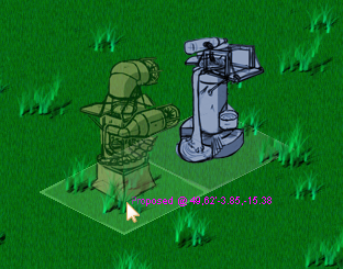
Easier said than done though :) Bunch of funky math involved, but I think it’s working out nicely so far. In the end, this let’s the player build nice rows of towers aligned efficiently.
Entry 48 about projectiles
Oct 10, 2011
Fireball deluxe
So let’s make a proper fireball (at least with semi-ready sprites):
![]()
This is the main projectile (fire ball), a burning cloud/trailing fire effect and a smoke cloud. More or less simple. Putting it all in the game (not that simple) makes this:
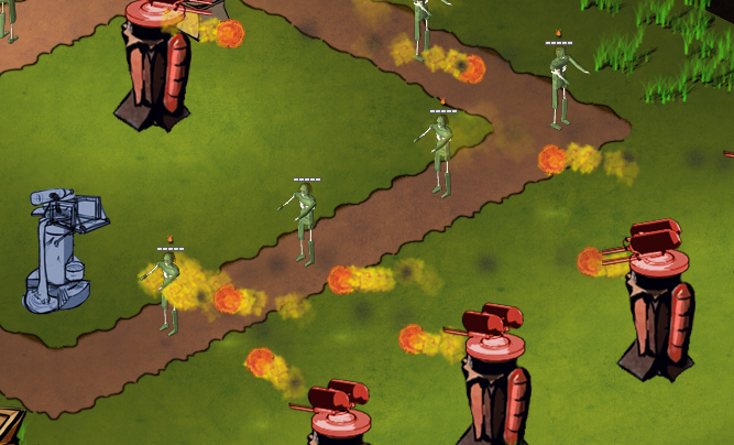
This looks better animated :) It’s definitely better than a 20x20px orange dot. Now there is some proper non-microscopic action on-screen.
Here’s an example of a simple flailed projectile without effects:

Here’s a stream effect:

Currently all projectiles follow the mob directly. So projectile coordinate -> mob coordinate. This means that projectiles following moving mobs (which is all of them) change their trajectory as they fly. This means that any effects from projectiles get slightly angled. This is fine for most effects, but things like water stream above get mangled a lot. The solution is to fire at an anticipated location where the mob would be when the projectile hits there instead. Though that means some funky math and some assumptions about mob speed/path. But it’ll have to be done…
Pee wee interjection
Philip drew a simple pee wee mob animation (I have no clue what “pee wee” means except, you know…), which I proceeded to butcher up the sketch and make a mob sprite as it may actually appear/work in-game:

This involved everything from proper sprite texture layout and sizes to offsets, ingame heights, animation frames and timing to new, shiny health bars. So now there’s something closer in game to what it may actually look like. You know, one tiny step at a time.
Back to projectiles
Anyway, back to projectiles and mainly water. Some time later I got to fix the proper angle work:

Orange line is the ground projection of the sprite, however it starts at the top of the tower — yellow line. A little trigonometry later that got fixed and now the stream is more or less straight, but there is still work to make it look proper.
In addition, I made full both water and ice projectiles/streams/impact/effects:

These are all made from multiple sprites at runtime:

With some coordinated timing, offsets, and movement it can be made to look pretty decently animated. At least, if the game goes live tomorrow, I’ll be happy with how it turned out even if it is not perfect.
The only thing currently is that I disabled projectiles following the enemies as they move. Instead I cheated to make the enemies receive damage regardless when the projectile reaches its destination. That’s the location of the enemy as it was when the projectile was fired. Of course, the enemy has now moved away, so it generally just hits the ground. Which means I need to estimate where each mob is going to and shoot a little ahead. Oh, the fun times ahead…
Entry 49 about tile effects and texturing
Oct 12, 2011
One of the many things I want to make is interaction with environment, or in this case with tiles where projectiles would hit. This means the ground getting hot/cold, wet/dry, etc. That would affect mobs and cause certain things to happen to it, like catch fire or conduct electricity. So here goes…
Firstly, let’s make a per-tile record of tile’s humidity (wet/dry) and store it in a -1..1 range with 0 being the default humidity. Then make the terrain become “wet” once the value passes 0, like so:

The water also “spreads” to the neighboring tiles and slowly dries out back to 0.
Obviously, this will not do from graphical perspective and needs some serious work. For now, here’s hot ground from fire as well:

Water cools and wets terrain and fire evaporated humidity and heats the terrain. So these work in opposite directions. There will also be ice, that can make water slippery :)
Now let’s convert this all into shader magic. First, let’s render blue and red tiles to a separate texture and pass this texture to a blur shader:

So we already get some nice blurry non-distinct lines. I’m not too worried about precision, as this will all get overlaid the terrain anyway, like so:

Now the big part. Have another shader apply a custom tiling texture only where the tile effect is in effects. So burnt lava-ish ground under red and water surface-ish under blue:

And this looks good enough for now, the non-precise blurring isn’t even noticeable. The ground would only get this saturated with the effect if there was several towers all working on it anyway. It’s quite subtle otherwise (Philip agrees :) ) We’ll see how this turns out.
Entry 50 about building base sizes and snapping
Oct 25, 2011
Resource buildings
First off, here are some resource (city) building I did in Maya with ramp (toon/cel shading) for further painting:

Round snap
Time for another building snapping/size iteration. Okay, so buildings can now be placed wherever the player wants. So why do we need to keep them square if they are not? So how about the same principle but round base:

That sounds too easy, much easier than implementing properly with collision detection, iteration through nearby objects, proposed build coordinate snapping with correct distances, etc. There, much better.
Now, here are the two different size bases — 3×3 and 4×4:

They don’t occupy the whole 3×3 tiles (150×150 in-game distance units) and 4×4 (200×200) area. So stuff can be built in the space in between. Here is implementing the same for the city/resource buildings:

Round base snapping seems much more intuitive, you can place it at any angle and it smoothly rotates around as you decide where to place. This could not be said about rectangular snaps. So, pretty cool!
Snap two!
Now, there is one problem. It tries to snap to the best/closest coordinate, which is the shortest valid distance to the closest tower. If the proposed location is invalid, the player gets a red ring:

This is fine for most cases, but there is one special case which is when the player tries to place the tower between two other towers. The algorithm fails as it is supposed to, but intuitively the player would want the tower snapping to both the towers.
So some really funky circle intersection math later:

When the algorithm is check for nearby buildings and looking for a snap location, it also remembers two closest buildings. So when it fails to propose a location for either of the towers, it does a special coordinate proposal at the border of both. This makes it a very nice and fluid placement tool.
But… (and there’s always a “but”)… this doesn’t quite work with 3 towers:

While I’d want it to snap with towers marked with orange lines, the closest ones are the ones marked with green. So the algorithm fails to snap. But you know what? Screw this. It’s a rare case as it is, and next thing you know I’ll be saying how 4 buildings fail to snap… I’m quite happy with what already works and works quite well.